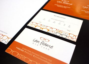
The purpose of a logo is to visually represent your business – to give a sense of what you do, as well as your level of professionalism and business capability. An effective logo inspires confidence in potential customers and builds recognition around your business. The team at Stream Design are here to assist you in developing your branding, but if you want to know more about the process of designing an effective logo, read on…
1. Research
Probably the most fundamental part of designing an effective logo is research. Before we even put pen to paper we always do a tonne of research. We look at competitors’ logos to get a sense of what is out there already and to ensure the design of your logo will be unique and different from your competitors. It also helps to get a general sense of how similar businesses visually represent themselves.
2. Concept
The next step is to work out a strong idea or ‘concept’ for the logo. For some businesses this is easy, for others a more abstract notion needs to be explored. For example, last year we created a logo for a flower grower. In this instance it made sense to use a flower graphic in their logo and this quickly gives a sense of what the business does. However what do you do for a business that does multiple things or can’t be represented so easily? Further ideas need to be explored. To brainstorm ideas we create a map/list of phrases that describe the business. For example our client Premium Business Group, describe themselves as a ‘financial services hub’ and our word list for them included words and phrases like, accounting, financial planning, tax, superannuation, strong, conservative, meeting point, hub, group, etc. We decided that visually describing a ‘hub’ would be a good strong concept.
3. Graphic
Now that the concept is decided upon we start making some quick hand-drawn sketches, rough in the beginning and finessing as we develop the style. This process helps us quickly come up with visual solutions and helps generate ideas about what the logo could look like. We usually scan the successful sketches and use that as a base for drawing up the final logo on the computer.
4. Typography
Once the sketches are drawn up on the computer, we really begin to look at the typography. It’s important to select a font that has the right look and feel for the business. In this instance we used a mixture of both serif and sans serif. If we want a truly unique look, we would consider a hand crafted type style.
5. Personality
Ultimately the style of the graphic and the typography give a sense of the logo’s personality. Colour also plays a big part. It’s important the logo’s personality reflects the personality traits of our client. Colour theory is a fascinating subject and is very important to consider when selecting the colour palette of the logo. If you would like to know more about colour, read our Colour Theory article. For example if a business is eco-orientated, the use of greens and browns would be a great choice. Blues give a sense of trustworthiness, professionalism and confidence, which is why they are used so regularly in the business world.
So as you can start to realise, the process is straight forward, but the solution is not always that simple. Pulling all these things together is how to design an effective logo. Engaging the services of a graphic designer is a key step in the process.
If you think it’s time for a re-fresh of your businesses logo, or if you’re just starting out, the team at Stream Art Design would be happy to have a chat about how we can visually represent your business. Contact us today and view our past logo designs here.