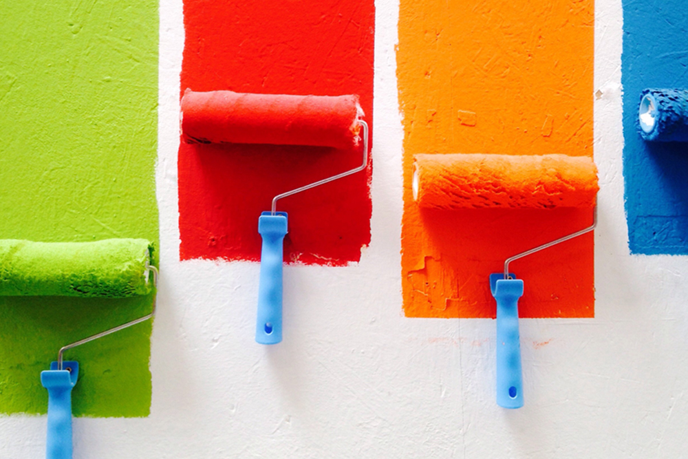
What colour should you use in your branding and why?
As you may already know, colour is an important aspect of marketing and graphic design. Colour plays a huge role in brand recognition, so it’s important to get it right and, when making colour decisions for your brand there is a lot to consider.
Now, there are no clear-cut guidelines for choosing your brand colours, however, the study of colour psychology gives you an interesting insight into the influence colour has over our emotions and decision making. In order to convey the right message, consider your target audience and what kind of feeling or mood, you want your brand to evoke in them. The use of colour plays an integral role in this aspect of marketing and design.
Read on for an overview of 6 popular colours, how they are utilised, and the influence different colours have when used in marketing and graphic design.
TIP: Colour has many meanings in other cultures, so do your research before using it in marketing for international clients.
Bold Red
 Red is a very powerful, dynamic colour that reflects our physical needs, whether to show passion and love, or conversely, to portray fear and aggression. So effective is red on our psyche that it has been found to raise blood pressure and respiration rates as well as enhance human metabolism. So, if you want to make an impression and get people’s heart’s racing, then use the colour red.
As a general design rule, use red sparingly unless you want to make a big impact. It is a dominant colour that can overshadow others very easily and can awaken all sorts of reactions in people and cultures depending on the meaning for them.
Vibrant Orange
 Orange has a very interesting psychological meaning as it combines red’s power and energy with yellow’s friendliness and fun. Orange still commands attention but is not as overpowering as red.
As many fruits and vegetables are orange, this colour is associated with health and vitality. This could also be why the colour orange has been found to stimulate our appetite. Therefore, orange could be a useful colour to use in any industry associated with food.
Orange is also known to be the colour of motivation and general enthusiasm for life and has strong associations with creativity. Overall, a friendly and vibrant colour that can be used powerfully in all kinds of branding and graphic design.
Happiness is a Yellow Blanket
 Yellow is the epitome of happiness, cheerfulness and optimism. Did you know, the wavelength of yellow is particularly long, making it the easiest colour to visibly see which makes it the first colour infants respond to?
Yellow is a great complementary colour to use in graphic design, a little note of warning – avoid using just yellow for headlines and text as it can impact legibility. However, teamed with a contrasting colour, it packs an energising punch that makes everybody ‘happy’.
Gorgeous Green
 Green is one of the most abundant colours in nature, reflecting life, rest, peace and vitality. Due to this connection with nature, green is commonly used as a sign of growth – whether it be physical growth like plants or wealth or spiritual growth, as in our wellbeing.
Overall, green is a very down to earth colour and if you’re looking to incorporate the idea of health, growth and harmony, then green is a good choice to use in your marketing and graphic design. Brighter greens are very energising, muted greens more representative of the natural world and use darker greens for stability and affluence.
Popular Blue
 Blue is a versatile and popular colour used in marketing and design, for good reason – everyone likes it!
Blue is a very effective colour to use in any branding that needs to appeal to a diverse target market. However, the meaning of blue is widely dependant on the exact shade and hue. Light blues are relaxing and offer a sense of calm. Bright blues can be energising and refreshing. Dark blues are frequently used in corporate designs and portrays the feeling of strength and reliability.
“Blue is the favourite colour for people in Australia and 16 other countries. In America 35% favour the colour blue, followed by green (16%), purple (10%) and red (9%)”
The Passion of Purple
 Purple is a passionate colour known for its imagination, spirituality and sense of luxury and magic. Did you know that the use of purple in regal situations is due to the expensive nature of the dye in ancient times – only royals were wealthy enough to afford it. Hence, the link to purple as the ‘go to’ colour for luxury branding.
As you can start to appreciate there is more to mixing a little bit of red, green and blue together to understand the use of colour in marketing and design. Colour touches and affects every one of us and plays a vital role in all our visual experiences. In your graphic design and marketing, colour is one of the most powerful tools that you can utilise and understanding how colour affects your target market is the key in communicating your messages effectively and ultimately creating a successful brand image.
Colour Stats:
Colour increases brand recognition by up to 80 percent.
Source: University of Loyola, Maryland study
Research reveals people make a subconscious judgment about a person, environment, or product within 90 seconds of initial viewing and that between 62% and 90% of that assessment is based on colour alone.
Source: CCIcolour – Institute for colour Research
They say a picture’s worth a thousand words, well one with natural colours may be worth a million, memory-wise! Psychologists have documented that “living colour” does more than appeal to the senses. It also boosts memory for scenes in the natural world.
Source: The findings were reported in the May 2002 issue of the Journal of Experimental Psychology: Learning, Memory and Cognition, published by the American Psychological Association (APA)
Colour can improve readership by 40%, learning from 55 to 78% and comprehension by 73%. Tests indicate that a black and white image may sustain interest for less than two-thirds of a second, whereas a colour image may hold the attention for two seconds or more.
Source: White, Jan V., colour for Impact, Strathmoor Press, April, 1997
References:
https://www.smashingmagazine.com/2010/01/color-theory-for-designers-part-1-the-meaning-of-color/
https://coschedule.com/blog/color-psychology-marketing/